Easy as 1, 2, 3!
1. CONSISTENCY IS KEY
Consistency can create trust, it looks professional and it creates a cohesive look. You want your images (and words, colors, etc.) to all be telling the same story from the same voice.
Use watermarks consistently
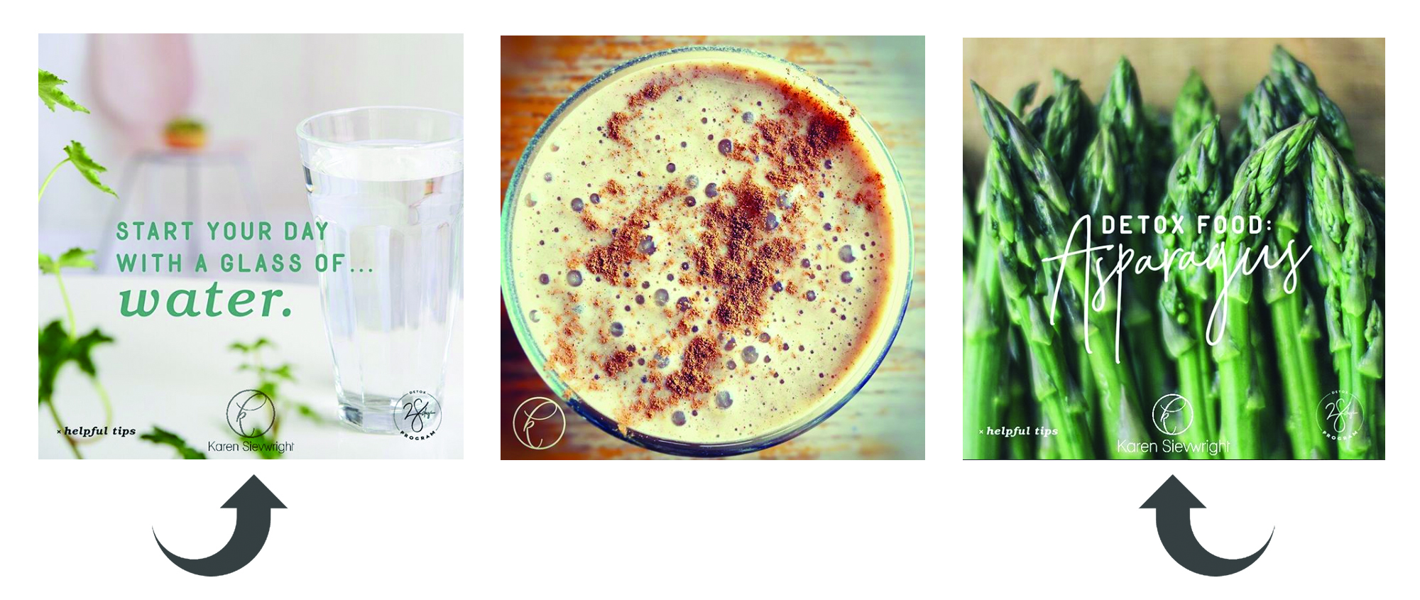
If you’ve decided to watermark your images, do it consistently. (Like @karensievwright) This will help create brand awareness and also helps for people to find you if your image gets shared. You don’t have to use a watermark, it just depends on your goal, but it could also be a logo, URL, hashtag, etc.

Keep fonts consistent
Choose a font (or two!) that reflects your unique identity and then only use those fonts in your branding. Again, you want your brand to come from the same person, have the same message and be the same voice.
Consistent color palette
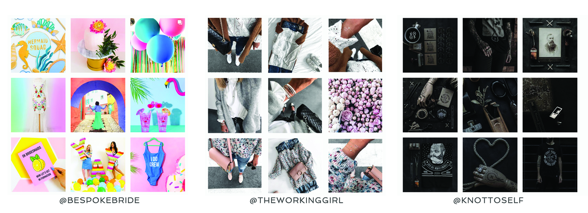
Below are some great examples of well curated images. I’m not saying you have to go to this extreme with colors and mood, but it’s a great visual representation of consistency with branding. Think about a few words that would describe your brand. Are you dark/moody? Maybe bright/white/clean? Or perhaps fun/colorful/vibrant. Just keep this in mind before you share an image!

2. TAKING THE PHOTO
Find good light
Whenever you’re taking a photo, you’ll want to have only on light source. I strongly suggest window light, as natural light is almost always best! Turn off all the lights in your house, find a window and possibly use sheer curtains to diffuse the light so there aren’t really harsh shadows.
Try different angles and take lots of photos
When taking the photo, watch what’s going on in the background. Make sure it’s clean and not cluttered. You don’t want dirty crumbs on the table, trees growing out of people’s heads, or (dare I say) toilets in the background!!

Amazing examples used above found here and here
Consistent editing
Hmmm … are you sensing a theme?? 😉
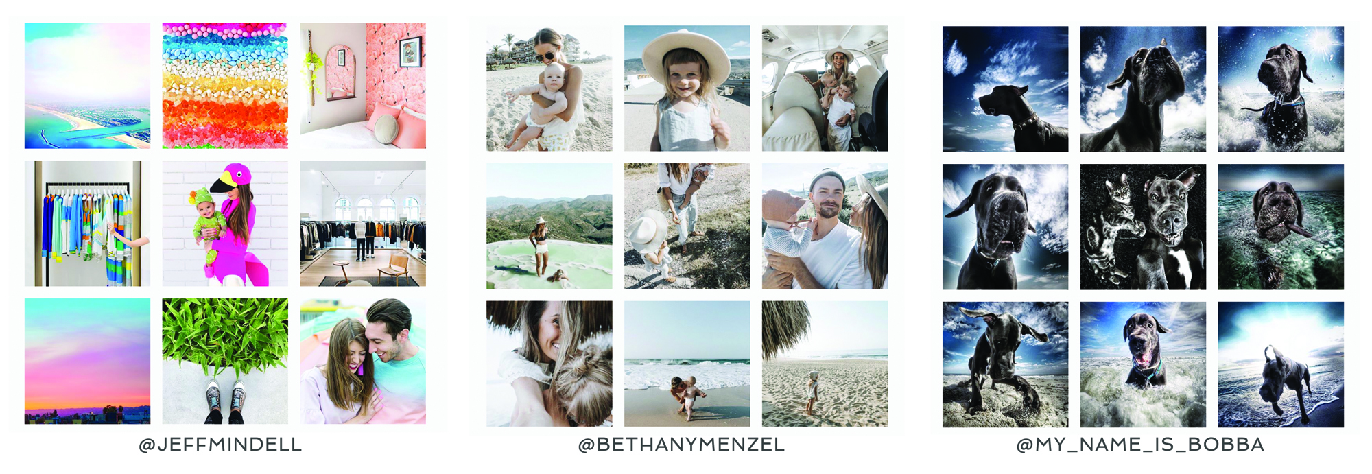
Below are some more examples with consistent editing. Again, these are pretty extreme examples. If you look at the images you can notice that some are muted and soft, and some are more dark or contrast-y. So pick one and stick with it!
Bottom line is that they should all look cohesive, but they don’t necessarily have to match.

3. iPHONE APPS
There are tons and tons of options out there, but below are a few of my favorites.
EDITING APPS

DESIGN APPS
 Easy peasy! I’m so excited to see what you create!
If you found this useful, please share with your friends and comment below! If you’re looking to take that next step, elevate your brand and connect with your dream clients contact me today.